CASE STUDY
Drove 90% autonomous ticket resolution through activation content
My approach to UX writing is consistent: I break down complex flows into smaller messages, figure out what users need to hear and when, and structure that information in a way that helps them move forward confidently.
This case study — about crafting the UI text in the L1 IT Service Desk AI Specialist activation flow — shows how my approach delivers real business impact.
Context
ServiceNow is a platform that businesses run their operations on. One of its largest product lines supports IT service management.
The L1 IT service desk handles tickets for the most routine issues, like a password reset. The key point of contact is the service desk manager.
The L1 IT Service Desk AI Specialist is a ServiceNow product that assists the service desk by resolving IT issues on its own — freeing up human agents for more impactful work.
Problem
IT service desk managers were drowning in routine issues, but they still didn’t trust the AI specialist enough to activate it immediately.
Two things gave them trust issues:
Unclear about how or if they could maintain control after assigning work
Unclear about how long it takes to activate the AI specialist
Solution
I crafted activation flow content that built trust with clear information about control and time commitment.
Activating the AI specialist is a quick 3-step process:
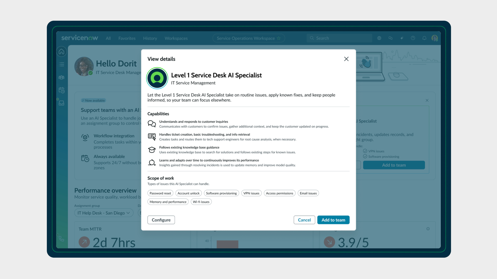
The service desk manager selects to add the AI specialist to their team directly from their workspace landing page.
The service desk manager then fills in a few details, like choosing which assignment group to include the AI specialist in.
After saving those details, a message appears confirming that the AI specialist has been added to the team. It even sets expectations about how the AI specialist gets assigned work and how the service desk manager can track its performance.
Note the information throughout about how the service desk managers maintains control, which addresses one of the named trust issues.
The landing page widget subheading says “Just add or remove it from an assignment group to control when it joins in on the work.”
The assignment groups subheading says “To stop the AI specialist from handling your team’s records, remove it from your assignment groups.”
The confirmation message informs on how the AI specialist gets assigned work and how the service desk manager can track its performance.
But what about the other trust issue around how long it takes to activate the AI specialist?
To help the service desk manager better understand the time commitment, I used the language of “Add to team” for action labels. This language conveyed the immediacy of the action, helping service desk managers feel more confident that this wouldn’t be a months-long process like onboarding a human team member.
Let me show you how I arrived at this solution.
Approach
The project followed a non-traditional sequence.
An executive requested a high-fidelity demo, which I helped create
This demo became a conceptual prototype that a UX researcher tested with service desk managers
I then iterated on content based on research feedback
I partnered with designers to create the initial demo and conceptual prototype, worked with a UX researcher who conducted concept testing with service desk managers, collaborated with product managers to align copy with product strategy, and worked with engineers to understand technical constraints.
The direction from leadership was to make it as quick and easy as possible for a service desk manager to activate the AI specialist after first discovering it. And so my bias when writing the content initially was to hide all the technical complexity and instead emphasize the benefits.
I also used the action label “Onboard” originally, since stakeholders really wanted this activation flow to mirror bringing on a human team member.
But we learned two things that really shook these assumptions:
Service desk managers weren’t getting enough information upfront to decide to activate the AI specialist. The activation flow only communicated the best-case scenario (automating incident resolution) without addressing how service desk managers could maintain control.
Onboarding human agents is actually a months-long process, whereas activating the AI specialist is instantaneous. Service desk managers wouldn’t understand that difference from an action label like “Onboard.”
So that’s when I reiterated on the content to get to the solution above.
I swapped the benefits-only language for clear information about control
I changed the action label to “Add to team” instead
And that’s when things really started clicking for service desk managers.
Impact
Not only did we see real adoption, but we also saw measured improvement in IT operations that used the L1 IT Service Desk AI Specialist.
Just look at the impact that it had on ServiceNow’s own service desk:
90% of IT support requests handled autonomously
96% resolution efficiency (improved from 81%)
85% of IT support agents redeployed to higher value work
The City of Raleigh, reported a 98% deflection rate using the product. “We’ve saved the equivalent of a full month of time,” said Mark Wittenburg, chief information officer at City of Raleigh.
The activation flow that I worked on was demonstrated live at Knowledge 2026 to over 25,000 attendees.
Overall, the activation flow resonated. I wanted to make sure that the service desk manager got the most important information at the key moment when they first discover and activate it. What the high adoption and success rates tell me is that service desk managers got all the trust they needed to move forward.
Takeaways
I learned a lot about myself working on this project:
I felt validated working on a fast-paced project and still being able to make an impact
I really honed my ability to think strategically about content and design while also executing on the details at a tactical level. To see the strategy work that I delivered concurrently, see my Autonomous Workforce case study.
Still, I know I can make even more of an impact when I can make the team faster and better, not just myself. For an example of how I’ve built enablement processes to scale content, see my UI Builder case study.